A Harmony of Hues: Exploring Natural Stone’s Peach Fuzz Palette

All eyes are on Pantone's highly awaited color of the year, Peach Fuzz. Emerging as a top trend in interior design, this soft peachy hue effortlessly blends youthful energy with timeless elegance. Pantone’s Executive Director Leatrice Eiseman expresses the color as “one whose warm and welcoming embrace conveys a message of compassion and whose cozy sensibility brings people together and enriches the soul.”
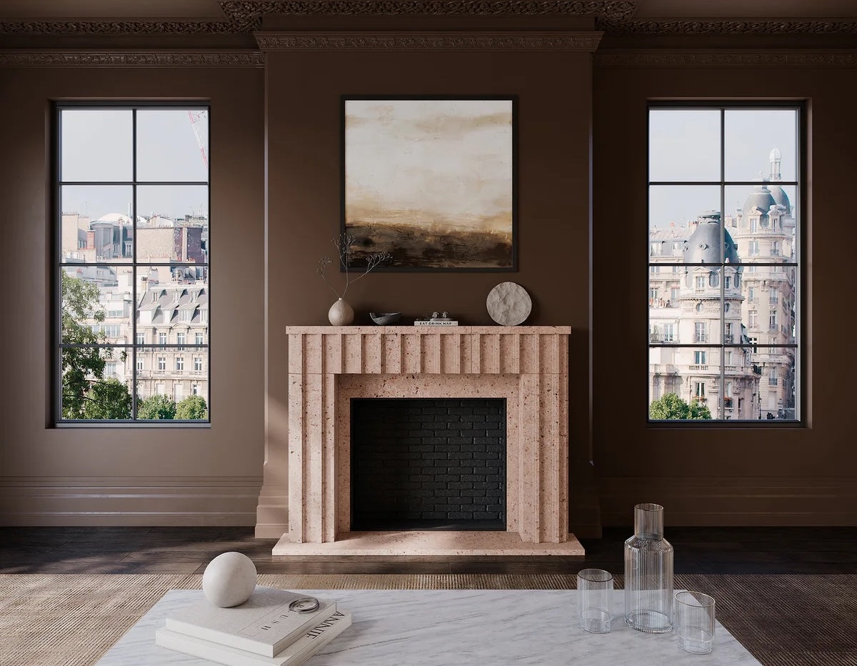
At MATERIAL Bespoke Stone + Tile, we curated a selection of natural earth tones ranging from Adoquins to Marble. Create a luxurious and renewed atmosphere that honors Pantone's vibrant color of the year.
“Color is a fundamental element that significantly impacts the aesthetic appeal, mood, and functionality of spaces,” said Makenzie Ihm, Marketing Coordinator at MATERIAL.
“Peach Fuzz resonates with timeless themes, evokes universal emotions, and transcends fleeting trends. When it comes to natural stone, striking color or veining are the first aspects that catch the eye. The variations in hue, tone, and saturation within natural stone materials contribute to the visual interest and beauty of a space.”
Warm tones create a sense of comfort, while cooler tones may evoke calmness and tranquility. Designers can use the vast color combinations of natural stone to enhance a space's functionality and visual appeal. Achieve balance and harmony by complementing the soft vibrancy of red palettes with other neutral stones in a few different ways:
Red is commonly associated with passion, energy, and warmth, while pink conveys sweetness, romance, and serenity. Each stone has a distinctive style that seamlessly suits exterior and interior designs with a level of natural detail. Customize the intensity and saturation to match the desired ambiance.
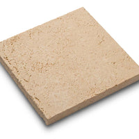
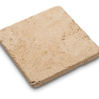
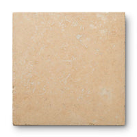
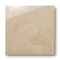
A brightly colored dynamic stone. Specs of brown, gray, and beige add dramatic movement and texture.

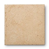
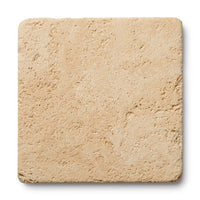
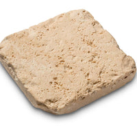
This Adoquin has a light brush base that is accentuated with dynamic movement and flakes of rust, gray, beige, and white.

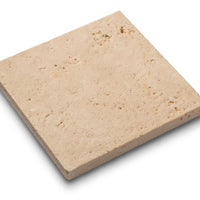
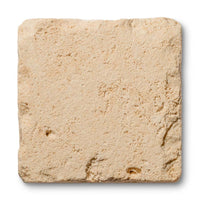
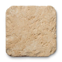
A striking stone with a range of rich browns, maroons, and rust hues like its namesake fruit.

Since 1965, MATERIAL Bespoke Stone + Tile has been delivering the very best in world-class stone, glass, and ceramic tile. For more information on all of our natural stone selections, schedule a virtual appointment online or contact us by phone to learn more about our showroom locations across the U.S.
Please note: comments must be approved before they are published.
* indicates a required field
Our finishes are applied by hand, ensuring that each element of your order matches and blends together well. In some instances, you may notice a natural variation in the application of the finish. This is normal and should be expected with a handmade item.